Xiaomi HyperOS 2.0: Is the Classic Control Center Gone for Good?
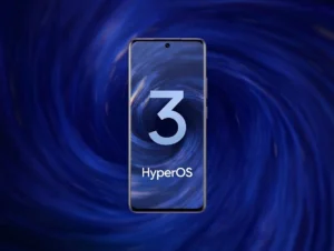
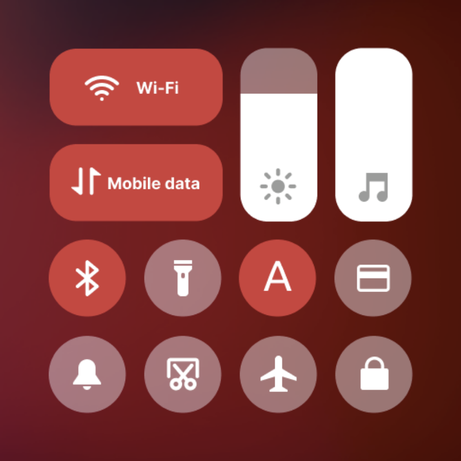
With the upcoming release of Xiaomi HyperOS 2.0 on October 29, Xiaomi fans are bracing for significant changes, including the possible retirement of the classic Control Center. For many users, this layout has been a staple since the days of MIUI 11, offering a familiar and easy-to-navigate interface. However, the recent beta updates of HyperOS Enhanced suggest that this beloved feature may soon be replaced.
Issues with the Classic Control Center
Users of the HyperOS 1.1 beta have reported several frustrating issues with the classic Control Center. Problems such as being unable to pull down the Control Center, alongside a misplaced brightness bar that obstructs other functions, have rendered the layout almost unusable. These persistent bugs, coupled with Xiaomi’s lack of fixes, point toward a complete overhaul of the Control Center in HyperOS 2.0.
| Key Issues with Classic Control Center | Impact on User Experience |
|---|---|
| Control Center doesn’t pull down | Limited accessibility |
| Brightness bar blocks other functions | Frustration with usability |
A Modernized User Interface
Xiaomi’s decision to possibly retire the classic Control Center is likely driven by the need to modernize its user interface. The bugs present in the current layout, combined with the demands of a more sophisticated and responsive design, make this change necessary. Moving forward, HyperOS 2.0 could bring a more streamlined and functional interface, enhancing the overall user experience and performance across Xiaomi devices.
While some users might be disappointed to see the classic Control Center go, this shift opens up new possibilities for a cleaner, more intuitive design that eliminates long-standing issues.
What to Expect from HyperOS 2.0
As the launch date approaches, excitement is building around the potential improvements in HyperOS 2.0. In addition to a redesigned Control Center, Xiaomi is expected to deliver significant bug fixes and optimizations that will improve performance, battery life, and overall responsiveness.
- New Control Center layout:
A modern design that addresses current usability problems. - Performance enhancements:
Smoother system operation, bug fixes, and better device responsiveness. - Visual upgrades:
A cleaner, more user-friendly interface.
Conclusion
The release of HyperOS 2.0 on October 29 will likely mark the end of the classic Control Center, but with it comes the promise of a more modern and efficient interface. Xiaomi users can look forward to improved functionality, bug fixes, and a fresh design that keeps pace with the latest trends in user experience. While the beloved Control Center may be retired, these changes signal a new era for Xiaomi’s software, ensuring that devices remain user-friendly and up-to-date with evolving technology standards.
Source: Xiaomitime.com
Xiaomi HyperOS 2.0 Control Center
Xiaomi HyperOS 2.0 may introduce a new Control Center layout, signaling the end of the classic design for improved functionality.
Tags: Xiaomi, HyperOS 2.0, MIUI, Xiaomi Control Center, Xiaomi updates, HyperOS, Xiaomi features, HyperOS 1.1, Xiaomi software, MIUI 11, tech news.
